
1/5000 Star Destroyer

It’s strange that every time I look at this completed kit I start to hear the ‘Imperial March’ in my head. I grew up with Star Wars, like a lot of people my age the original Trilogy was my introduction to the series and Scifi as a genre. When one of my buddies turned me on to this upcoming release I preordered it immediately.
There are currently two versions of the Bandai 1:5000 Star Destroyer, one includes LEDs the other does not. If you’re already comfortable with wiring up LEDs I’d recommend the base model, but if you want something that looks good right out of the box. The LED version is the way to go. This is the LED version of the kit.
This is the 28th and last build of 2019! It was a really nice kit to end the year on.
Kit Talk:
One reason I love the Star Wars kits from Bandai is their simplicity. These models take comparatively little time to build and paint. There are no inner frames, or intense articulation to worry about (excluding the 1/12 figures). This model was built in a single sitting on stream and painted in basically one afternoon including the masking the hull several times. Building this kit has reminded me how much I like working on this line, and I’m seriously considering building several more Star Wars models next year.

Gray Primer
Base coated the entire model with Neutral Gray #5 (almost black)
Several thin layers of Neutral Gray #3 including highlighting raised areas
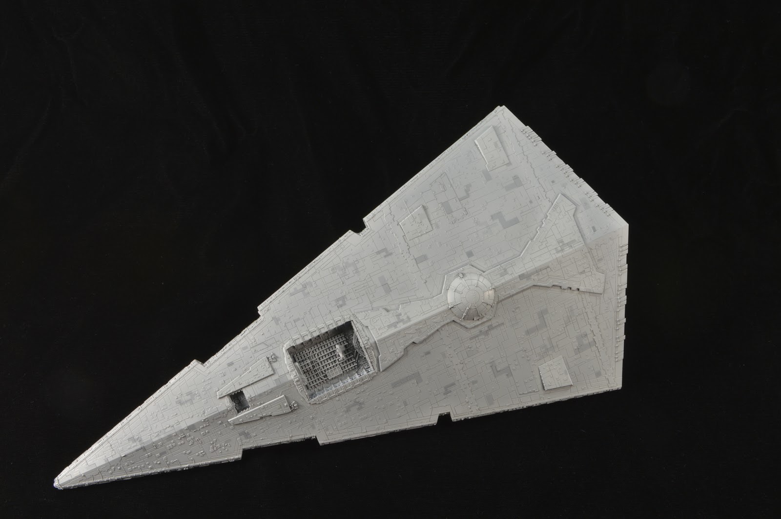
The first layer of masking for the ‘aztecing’
Several thing layers of Neutral Gray #1 & 2 with additionally masking for ‘aztecing’
Removed all the masking
A final thin layer of Neutral Gray 1 & 2 to blend the ‘aztecing’ with the rest of the hull colors
I realize the term ‘aztecing’ is more of a Star Trek thing, but the idea is the same. I used a variety of grey tones masked in simple geometric shapes to break up the giant field of gray.
The process is pretty fun and I think the shading turned well, the hull has plenty of color variation and a decent patina without looking completely filthy. If anything I should have applied another thin layer of grey to some of the darker patches to reduce the contrast and tie everything together better.


Comments
Post a Comment